Get started using a burndown chart to track your project

Georgina Guthrie
May 28, 2021
Ever feel like there aren’t enough hours in the day? If you’re a project manager, you probably don’t even have time to say ‘yes;’ you’re that busy. There are budgets to manage, tasks to prioritize, teams to check in on — it’s a lot. And on some days, it feels like you’re barely staying afloat.
As a project manager, the ultimate goal is to get tasks done on time and within budget. The key to staying on target and not getting daunted by a monster to-do list is good time management. But beyond just staying on top of things, it’s important to invest time in learning new techniques to improve efficiency. And one such method you should have in your armory is the burndown chart.
What is a burndown chart?
A burndown chart is a graphical representation that shows how much work you have left to do versus the time you have to do it. So if you’re managing a team, your chart will show you how quickly everyone is getting through the workload.
The good thing about seeing this information visually is that images are much easier to process than words. Just think about it: What’s easier to take in at a glance, a page of writing or a picture?
Types of burndown chart
There are two main types of burndown charts that PMs tend to use. You can have a burndown chart for an entire project or a burndown per sprint (for those working via Agile).
When creating a burndown chart for an entire project or product, you’re going to have a lot more story points. Everything from beginning to end will appear on your chart. And, because of this, the chart will likely be more subject to change. As tasks are met, conditions change, or new ideas are added, you’ll have to add, subtract, or readjust story points to properly reflect this in your chart.
The other option, creating your charts by sprints, is likely to be more static. Depending on how long your sprints are, you won’t hit too many road bumps that require complete reorganization. Two weeks is a common timeframe for a dev sprint, but yours could be longer or shorter, depending on your team’s needs. As you check off tasks, your burndown chart will track as planned until recreate or reset it for the next sprint.
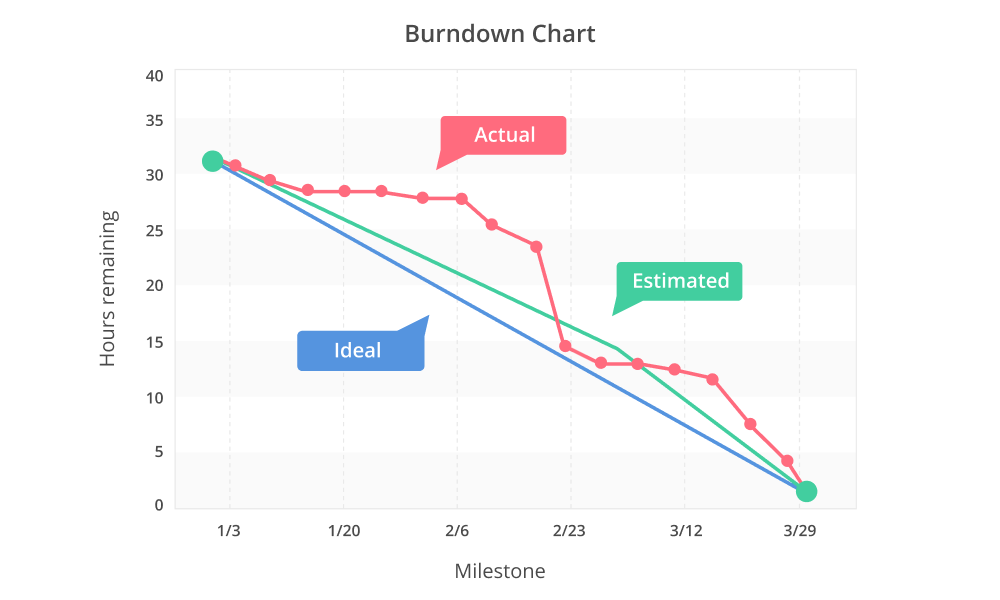
Reading a burndown chart
The amount of work that’s left to do is shown on the horizontal axis, while time is shown along the vertical axis. There are then usually three lines that each represent three different types of progress:
Estimated shows the estimated progress. It is calculated from “due date” and “estimated hours.” The actual line crosses over the estimated line when tasks are completed on time.
Ideal is a straight line that’s created by averaging the number of tasks by the number of days. So as time passes, the amount of outstanding tasks decreases.
You can use this line to verify whether or not a plan was accurate. It isn’t usually spot-on because it’s based on estimates, but the closer you are, the better. If you were off by a lot, you could use it to figure out where things went off-track.
Actual (aka Real) shows actual progress and any outstanding tasks. The estimated hours will decrease as tasks are completed. There should be a point on the graph for each day to keep your line up-to-date and accurate.
Assessing progress
In the beginning, this line and the Ideal line are at the same point. Then, as the project (or iterations) progresses, the Actual line will fluctuate above and below it. When it’s sitting above the Ideal, it means there’s more work left than you had estimated, and you’re running behind. If it’s below, then you’re ahead of schedule, and there’s less work left at this point than you’d originally anticipated.
Just as it’s important to find out why you’re behind schedule, it’s equally important to work out why you’re ahead: Vastly over- or under-estimating progress can lead to a demotivated team. So after your project or iteration is complete, run a post-mortem meeting to review the project’s performance using a technique called earned value management.
Evaluating your performance means you’ll have more knowledge that you can use to better estimate the next phase or project.
Benefits of a burndown chart
As you’ve probably figured out, it’s another string to the project manager’s bow. It helps you see progress at a glance, so you can make adjustments earlier to stay on track.
It’s also incredibly easy for team members and stakeholders to see for themselves how things are progressing. This has the added benefit of empowering individual team members to deal with bottleneck situations or scheduling issues before they unfold. It also shows teams how far they’ve come and what they’ve achieved, which helps with motivation.
Downsides to a burndown chart
As with all things, there are limitations to the burndown chart — namely, that it only shows part of the picture.
For example, it doesn’t show tasks currently in progress; it only those that have been completed or those that teams are yet to start. And if the Ideal line has been overestimated, teams could become disheartened when they continually see they’re running behind schedule. One way to get around this is to calculate earned value management at the end of each stage, so you can more accurately predict the next one and avoid demotivating gaps between expectation and reality.
A burndown chart can also oversimplify things. For example, if you’re working in Agile, it won’t show if more story points have been increased or decreased in a backlog, which means the scope of work will have changed. It also won’t show which items have been completed, so you won’t be able to see whether the team is completing the right things in the right order.
Keep in mind that it’s a tool for mapping trends rather than specifics, and you’ll need to combine it with other tracking processes to get a more detailed analysis.
Final thoughts
The burndown chart is a great little tool for tracking project progress. It’s especially useful for managers working on time-critical projects because it lets you see, at a glance, how much work you have left to produce.
To have the best chance of success, it’s important to update the chart every day, so your lines are an accurate reflection of your output. Fall behind, and you’ll potentially miss your deadline — or worse, leave the team feeling flustered and demotivated.
One of the easiest ways to maintain your chart is to use project management software, which tracks metrics for you automatically. Another benefit of working on an online chart is that everyone can access it, from wherever they are. It’s always kept up-to-date because it measures progress automatically; you don’t have version control or update emails to worry about.
Backlog, our own project management tool, is cloud-based and features an intuitive dashboard that shows your burndown chart — plus any other time-management charts — in one place. It also sends out notifications to the team when project settings are changed, issues occur, and milestones are reached, so you hand over time-consuming admin to the software, reclaim a little more time, and cut that enormous to-do list down to size.
This post was originally published on January 8, 2020, and updated most recently on May 28, 2021.

